Blog Post 3: Working information your way
- ashleenicolewilson
- Nov 28, 2022
- 3 min read
I want to start this blog by saying that I’ve never been good with numbers. I could never imagine myself pouring hours of the day intensely staring at excel spread sheets until my eyeballs pop out. The thought made me tremble and vigorously deny that I could ever have any involvement with data analytics because it belongs in this untouchable realm of “big brains.”
Information can be overwhelming. One thing that I’ve learned from surfing through heaps of information is that there’s so much of it. There are facts about all sorts of interesting subjects that people don’t even know they’re dying to know yet and you don’t need to be a crazy genius to get it. Most things nowadays are just a google search away. All that intimidation wears off quickly when you realize you don’t have to have a thousand wrinkles on your brain to understand what Mr. Google can pull up in two seconds. However easy it seems; journalist’s still have to do the leg work of making information both trustable and digestible to the masses.
On this assignment I was recently asked to provide a data sheet for something I’m passionate about. Now I’m passionate about many things, but considering my end goal is food journalism, I figured now probably wasn’t the time to express my love of show tunes (how would that even look in a data sheet, I ask you?) I tried to keep things simple and went with something like cereal. Cereal’s great and people still eat it, right? I got about half way through my research on cereal nutritional facts when a thought strikes me “Now I have the information, but what is it saying to me? What question is it answering for my audience?”

It was like a punch in the stomach. What was I even doing with this information? Panic surged through my veins like ice water. I was looking at my excel sheet and I was feeling really sorry about myself. I was seconds from scrapping the whole thing when the voice of reason shifted the chess board around and I saw things from a new angle. I asked myself another question: “how many people do you think consume the same bowl of glass we call cereal, on the daily, without knowing what’s actually in it?”
I was willing to bet that more people knew which cereals were considered healthy without actually knowing why. So, I singled out two very important columns in my information sheet. The calories, and sugar (then I added sodium for people who have high blood pressure) which I compared and organized into an infographic. While it’s nothing flashy or bursting with information, the information is impactful and neatly organized in a way people can consume.
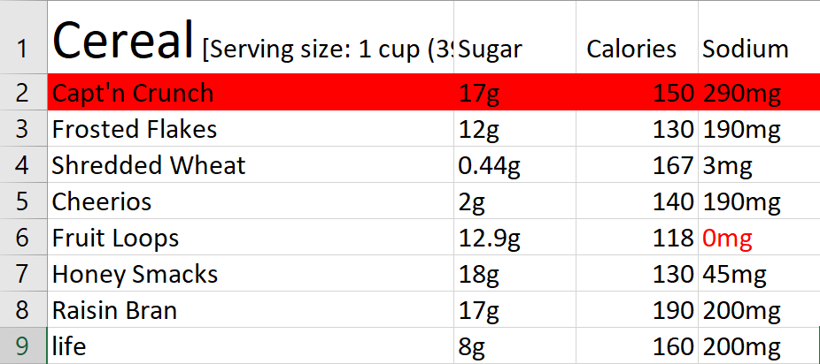
You see, without someone to organize it, data is just data—meaningless gobbly gook that will mostly go unnoticed. I assembled nutritional facts from different cereals, and placed them together in a formation that answered my previous question. My audience can see this information, compare it, understand it, and learn from it. Sure, it’s not ground breaking levels of information, but I’m informing them and they’re taking away something from it in the end. There weren't any complicated calculations, and I didn't pour through hours of case studies (though I respect those who do this on their daily grind.) While this my assignment is based on simple cereal nutrition data, what if we substituted all of that with nutritional fact from local fast-food places? Or recipes people were interested in replicating at home? I don’t know about you but I’d want to know if the lentil soup from Carrabba’s was as chalked full of calories as a big mac. The content of the data is a variable that can determine its value and human interest (like a graph that shows the popularity of local donut shops versus something like sugar in gluten free donuts. Both would clearly draw in different audiences)
When working with data, the context of the message you’re trying to get through to your audience can always change and shift, but the communication should always be at the core of your thinking. What are you trying to tell people? Use your data to establish a coherent and clear message, even if it’s not game changing or overly complex, it can still be interesting and informative.


Comments